My inbox is full of emails about Pantone’s new colour for 2024, Peach Fuzz. As I stated in January last year in my article about Pantone’s colour for 2022, Very Peri, I find the whole idea of having one single colour to represent the year a bit dubious along with many of the hues selected. I chose my own colour of the year 2022, gold, as I felt it was a relevant colour for rugs at the time and it was also uplifting and optimistic for a year when we were all feeling a bit shell-shocked post-pandemic (see ‘Going for gold: the hue for 22’ posted on 12 January 2022).


If you are going to publicly declare one colour to be the antithesis of a year, it needs to be super relevant and meaningful. My only experience with the colour peach goes back to the 1980’s, when as a child I had half a wardrobe in the sickly colour. I’ve not worn the colour since and it still reminds me of stirrup leggings, bat wing jumpers, and 80’s-style headbands. But I know this is not about me, so I looked online to discover other opinions.

In an article for Dezeen, design writer Michelle Ogundehin, comments: ‘It’s nice. Which is a thoroughly loathsome word, often lumped together with kind.’ To Ogundehin, it is a compromise of a colour, not bold enough for a world facing wars, disease and environmental calamity. She continues, ‘I see only compromise. I see a colour widely used in the 1950s to paint the walls of swanky fashion salons because its flattering glow wrapped the privileged clientele in a permanently good light.’ As if in response, one of my colleagues called it ‘glorified beige!’

For Pantone, it ‘echoes our innate yearning for closeness and connection’, but for many it might be a little bland, lacking the drama of 2023’s Viva Magenta. For me I think it is the name that is the most off-putting thing. Looking online I discovered it means the soft hair on the body—I guess on white skin. It doesn’t help.

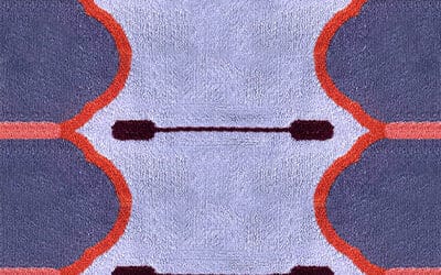
However, in an effort to be positive about the colour I looked through our latest issue of COVER (edition 73) and saw how many beautiful rugs I had chosen to include that feature the colour peach (see Hotlist, COVER 73). It was then that I realised how a colour can be reinvented, totally transformed in a different context. Add a deep red, or a splash or blue and grey, use it playfully and to bring in warmth, add it to a cool design and the colour peach becomes contemporary and speaks more of today’s interior spaces. So perhaps the 2020’s will reunite me with this colour, one that I would be unlikely to refer to as Peach Fuzz.