The world is feeling blue. Global colour company Pantone crowned 2020 as the year of Classic Blue; a shade described as ‘instilling calm, confidence, and connection’ to signal society’s ‘desire for a dependable and stable foundation on which to build as we cross the threshold into a new era.’ What Pantone didn’t predict is that the new era was Covid-19. Feeling calm, confident, and connected are luxury emotions few can find at the moment.

Ptolemy Mann
Blue—or more specifically the emotion known as ‘feeling blue’—is a requisite of music. The genre known as the ‘blues’; 1968 easy listening hit Love Is Blue; Joni Mitchell’s Blue; and don’t forget the blue, blue world created by Eiffel 65 in 1999. Emotional blue is associated with sadness, but here we shunt emotional blue to the side and celebrate the colour blue in all its shades.

Clouds, Olaf Breuning, Public Art Fund New York City, 2014
Read on to discover the fascinating world of blue in a 2014 article from COVER, in which Denna Jones sings the praises and reflects on the cultural significance of the world’s favourite colour. When you’re done reading, why not cut out a giant cardboard cartoon cloud, paint it blue and ‘fly’ it in your window or garden in a show of defiance, hope, and solidarity as well as homage to the artist Olaf Breuning whose glorious public art installation Clouds graced Central Park in New York City in 2014? Let’s try to keep the blues at bay as best we can in trying times.

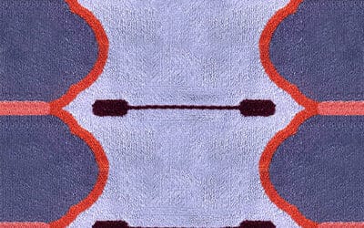
New Moon
The people of the world have spoken. Commissioned by dissident Russian artists Komar and Melamid in 1995, marketing companies polled sample populations in fourteen countries to find out the most popular colour, in advance of the duo’s project The Most Wanted Paintings. World citizens voted blue the king of colours. For lovers of the colour, being true to blue means immersion in history and drama.

Louis de Pootere
If the sky above were a paint chip factory it would be famed for its hues of blue. In fabric dipped in a dozen indigo dye baths over months by clothing retailer Okura, Japan, it looks as though the dye was plucked from the night sky in Galloway Forest, Scotland. The forest is an area recognised officially as a Dark Sky Park, where light pollution is an unknown. Scottish stars smoulder in the indigo sky like chips of faded smalt where purple-blue cores pulse through blue so degraded it alters to pure stellar white. In 1760 merchant Jonathan Warner ordered the walls of his bed chamber painted in smalt—a scrumble of coarsely ground cobalt blue glass mixed into wet paint. Okura wants its garments to ‘grow’ and fade with the wearer. As the indigo forest sky fades before dawn a ‘sashiko bleue’ sky yawns, then matures into a midday ‘teinté à l’indigo’—hues used by French firm Ôtsuki Sama for its range of blue domestic textiles.

Interior by Richard Rabel Interiors and Art Ltd with carpet by The Rug Company at Kips Bay New York. Photo Nickolas Sargent
The vivid blue pigment ultramarine is ground from lapis lazuli. Historically, lapis lazuli was rare and expensive, on account of the difficult extraction process and the remote location of the gemstone mine—Sar-e-Sang, Jurm, Afghanistan. Western Renaissance artists therefore reserved it for the robes of the Virgin Mary. Its constituent part, azurite, is so deep and clear a blue pigment that its name is associated with the skies in high-altitude deserts. Decreased levels of oxygen ‘concentrate’ the blue of the desert skies, the opposite of the alkaline process that creates woad blue, where the blue tint appears only upon exposure to oxygen.

Oyyo
If the sky above were a blue stone quarry, white clouds would mark the holes where mythical gods quarry slabs of blue sky and lever them to fall on earth—creating buildings like Rotterdam’s row of early 20th-century houses ‘dip dyed’ in indigo blue. Blue slabs tumbled into the parched desert of Thar in Rajasthan, India to build the blue city of Jodhpur. No one knows for certain why the city is blue. Are these structures defiant visual metaphors for the water that a legendary curse said the city would lack? Or reflective cooling devices against the desert heat? Or do the blue houses represent the influence of Brahmins, who many believe extended the caste system to colour-code their houses? Jodphur is where Swedish company Oyyo (Lina Zedig and Marcus Åhrén) employ craftspeople to handweave organic cotton dhurries. Local plants provide the dyes. The blues and greens are produced from natural indigo. Like Okura’s, Oyyo textiles fade naturally because indigo ‘is sensitive to ozone pollution’, as the company warns. Ozone turns the blue ‘yellowish’, which washes away and returns to blue, but the intentional fading remains.

Galerie Diurne
When the quarry gods hewed their slabs they sifted the blue and white rubble to become the blue and white seaside town of Sidi Bou Said on the northern coast of Tunisia. Paul Klee visited in 1914 at the invitation of Auguste Macke from the German Expressionist group Der Blaue Reiter (The Blue Rider). Member, Wassily Kandinsky believed blue was the colour of spirituality: the darker the hue, the more it stirred humanity’s quest for eternity. Blue and white were Matisse’s building blocks for Polynesia: the Sky (1947) where white birds circle above cerulean and indigo blocks framed by seaweed fronds – the same seaweed motif Matisse licensed for silk twill scarves produced by Ascher. So too his fronds are reminiscent of the algae Anna Atkins placed on cyanotype paper in 1843 to create delicately shaded blue photograms.

Henri Matisse for Ascher
SOAKING THE WORLD
French light artist and neo-Dadaist Yves Klein awarded his name to the deep ultramarine hue known as International Klein Blue (I.K.B.). He coated nudes in I.K.B. paint to create ‘Anthropometry’ body impressions on sheets of paper, with results resembling Matisse’s paper cut-outs. Writing at the time, Sam Hunter described Klein as wanting to ‘soak the world in I.K.B.’ Artist Gracjana Rejmer-Cánovas’s 2014 exhibition at the Platform Gallery, Habitat, King’s Road, London ‘soaked’ the white space with her painting installation Colour Into Liquid Air. Influenced by American Abstract Expressionists and Colour Field painters, her bold blue canvases have saturated intensity.

Claire Gaudion
When the rubble from the sky-bound quarry gods was no longer needed to build blue and white cities in Tunisia, Greece and elsewhere, enough remained to produce blue and white Delft tiles, Portuguese, Spanish and South American tin-glazed azulejos, and Chinese and Japanese blue-and-white porcelain.

Catherine Martin for Designer Rugs
The popularity in Europe of Japanese Arita porcelain in the 17th century resulted in derivatives including tin-glazed Dutch Delftware. The exterior of Roombeek’s Combined Heat and Power plant by architects Cie—the Stadshaard or ‘city hearth’—is cloaked in Delftware tiles designed by Hugo Kaagman. The interior walls of Cairo’s 1760 Sabil-Kuttab are lined with Delftware tiles. The lure of blue and white tiles has been translated into textiles and rugs including Floor to Heaven’s Delft Floral rug (2014), and Classic Rug Collection’s Blue Mosaic hand-knotted rug with recessed hemp as the ‘grout’ between the blue and white wool and silk ‘tile shards’.

Kinnasand
But the sky above isn’t always hues of blue. In auroras—the Northern and Southern Lights—greens, blues and purples appear as though a sky god unfurled giant versions of Danish company Kinnasand’s Woven Poetry curtains. When Indonesian volcano Mt Tambora erupted in 1815 it cast a malevolent fisherman’s net of sulphates across the globe. In parts of North America and Europe, 1816 became known as the ‘Year without a summer’. Blue skies became red and yellow. Crops failed and people starved. Many feared the change was permanent.

Modern, Caravan
But red and yellow eventually retreated from the skies, and their influence over blue was once again limited to the dyes used to produce blue. Woad is yellow by nature. Compounds in its leaves—red (indirubin) and yellow (flavonoid)—shift from yellow to blue during the dye process. Ratios between the two are critical to the creation of the correct shade. Woad is a temperate climate plant, which made its dye ideal for wool, whereas tropical indigo was perfect for cotton and linen. Indigo uptake in 17th-century Europe threatened the livelihood of woad dyers. Woad lovers called indigo ‘fraudulent, destructive, and corrosive’. But despite an imperial decree by the Duke of Saxony to protect its users, woad retreated and its supporters lamented that ‘dyed goods were injured.’

Beukelsblauw in Rotterdam by Florentijn Hofman
Woad has 21st-century supporters. French expert Denise Siméon-Lambert teaches classes on woad dyeing and its history. Woad wealth built the Renaissance mansions of Toulouse. Napoleon’s army wore woad-dyed uniforms. The Unicorn Tapestries (ca. 1495–1505) in the Cloisters, New York have woven blue woad grounds joined by weld (yellow) and madder (red). For Yves Klein, ‘blue is the invisible becoming visible’, and this is true of woad blue. Woad dyeing drowns blue’s identity in repeated alkaline dye baths, until the critical moment is reached and the textile is exposed to oxygen so that woad can breathe and turn blue. Amiens Metropole (Museum of Picardie, Amiens Metropole Libraries, Amiens Maison de la Culture) is the lead partner in the 2013–14 EU-funded Beyond the Blue: Woad/Waide project; it also includes the Fashion and Textiles department at the University of Brighton, and Brighton and Hove City Council. As part of the cross-nations project into all things woad, Barbara Hewitt’s book Blueprints on Fabric is guiding workshops in printing cyanotype fabric photograms.

2LG Studio for Floor Story
KING OF COLOURS
Some colours – red in particular – can turn blue through exposure to light. Inexpensive hairdressers and barbers from California to Calcutta display unintentionally blue posters of hairstyles and haircuts in their shop windows. They are full-colour when new; but repeated sun exposure bleaches the printer’s inks, leaving blue behind as last man standing. American mid-century Abstract Expressionist Mark Rothko used lithol red (PR 49) pigment—the same formula as the bright, bleed-resistant and cheap printer’s ink used for the hairdresser’s posters—in his Seagram murals (1958–59) and Harvard murals (1962). Although lithol red was known in the printing industry as highly fugitive, corrective fixatives were avoided to keep the price low; the textile printing industry, however, treated fabrics when using lithol red to make them colourfast. Rothko’s mixture of lithol red and ultramarine proved degenerative, and Harvard’s five paintings are no longer on view. Damaged because of pigment choice and the effects of daylight, once-red areas now appear smalty blue, confirming that blue is not only the king of colours, but also a colour that seeks to conquer the colour spectrum.

Edelgrund